WCAG made easy for content creators
WCAG stands for Web Content Accessibility Guidelines. They are the guidelines you must follow to meet the UK Government's accessibility requirements. The WCAG guidelines are a legal requirement for public sector organisations but every organisation should follow them to meet the Equality Act 2010. Organisations that don’t, risk legal action. Plus, it makes your content better for everyone.
WCAG is notoriously confusing. It is complex and generally aimed more at developers than content creators. That’s why we try to make it as simple as possible, highlighting the key requirements content creators need to know.
Colour contrast
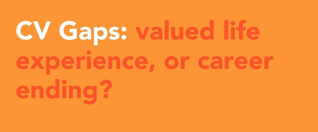
If you are using colours as text or background, they must have enough contrast. Without enough contrast, the text becomes extremely difficult to read, especially for people who are colour blind. Around 1 in 12 men and 1 in 200 women have some degree of colour blindness. This issue is especially common in social media graphics and presentations.
Use the Web Aim colour contrast checker to check if you have enough contrast between the text and the background. You should have a contrast ratio of at least 4.5:1.
Real examples from LinkedIn with very low colour contrast.
Alternative text
Alternative text, often referred to as alt text, is a short description of an image for screen readers to read out loud. It’s also shown in place of images if they can’t be shown for any reason, like a slow internet connection. Here are some tips for writing alt text:
Imagine you're describing the image over the phone.
Don’t go into too much detail if it isn’t relevant.
Think about context. A group of people at a funeral would be described differently than a group of people at a party.
If an image contains text, you must write the text out in the alt text.
Headings
You must assign headings so screen readers can easily navigate the content. You can not simply style text to look like a heading. Headings must be tagged correctly using the built-in heading styles in all the most popular programs used to create content.
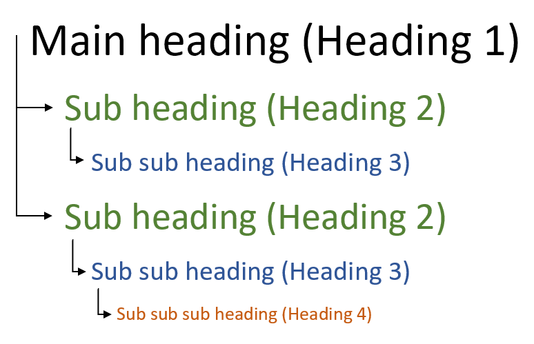
Headings must be used in the correct order. The main page title will be Heading 1. Headings below that will be Heading 2. If there are sub-headings within Heading 2, they will be Heading 3. You would then go back to Heading 2 for other headings.
Fonts
Inaccessible fonts can be much more difficult to read, as it can be hard to distinguish between different letters and characters.
Standard fonts like Verdana, Calibri, Arial and Tahoma are designed to be more accessible. Don’t use any cursive or decorative fonts.
Once you have an accessible font, you should keep styles to a minimum. Italics, paragraphs of bold text or words in all capital letters can be very difficult to read and so should be avoided. Underlining should only be used for links.
Descriptive links
Screen reader users often also navigate a page or document using links. The screen reader will read out the links on the page, but not the text surrounding it. This means the link text needs to clearly say where the link is going, rather than just saying ‘click here’, which means nothing to the user. Instead, you should provide short text to describe where the link is going, which should make sense when taken out of context.
“To view our latest research on sight loss, click here.”
In this example, a screen reader will only read ‘click here’. The user will not know that the link is to view the latest research on sight loss. Instead, you should write:
"View our latest research on sight loss."
Tables
Tables should only be used to present data, not as a layout tool. Tables used incorrectly can cause issues for screen reader users.
A table should only contain data and must be structured correctly. They should have:
A heading column and/or row
No merged cells
No nested tables
No empty cells
If your table doesn’t follow those guidelines, you should think about structuring the content in other ways.
Video captions
Captions display a text version of the words being spoken in a video. Captions don’t just benefit users who are deaf or hard of hearing. Captions also benefit people watching a video in a noisy environment, on a quiet device, or in public without headphones.
Make sure every video you post with speech in, including Instagram stories, has captions. YouTube, Vimeo, TikTok and most other social media platforms create auto-captions that you can edit before you post.
Language
Using accessible language isn’t just for people with disabilities, it’s better for everyone. It is especially important for people with learning disabilities or people whose first language isn’t English. Tips on using accessible language:
Write clearly and simply in plain English, aiming for a reading age of 9
Don’t use jargon or company-specific terms
Avoid using acronyms. If you do need to use them, explain what they mean
Use short sentences and paragraphs
Grammarly is a content writing and grammar checker which helps you keep your language accessible.
More tips on accessible language
Alternative formats
It’s best to keep your content as simple as possible so the need for alternative formats is reduced. However, some people with vision impairments or learning disabilities will still require them. Alternative formats include things like braille, sign language and Easy Read. It also means offering alternative communication methods, like telephone or text. If someone asks for an alternative format of your content, you are required to provide it to them.
WCAG levels
Please note, there are different levels of WCAG. You can be AAA compliant (highest), AA compliant (middle) or A compliant (lowest). Our guidelines focus on being AA compliant, which is the standard most people follow. The guidelines we’ve highlighted do not make your content completely accessible, but they are some of the most important and will make a huge difference to your users. Your website and any other digital offerings need to be accessible too.
Need help? We provide easy-to-understand accessibility training for content creators. Get in touch to find out more.


