How to use accessible headings
Headings are used for two reasons; to make text easier to read and to allow screen readers to navigate. Screen readers use headings to get an overview of what the page or document is about and navigate to what they want to read. It is also important to split content up using headings as it helps readers scan the page and find information quickly.
You cannot simply bold text to make a heading, you must use the built-in header styles available in Microsoft Word, email providers and content management systems. If you just style your text to look like headings or subheadings, screen readers cannot tell the difference and will just read on through.
Where to find the Styles pane in Microsoft Word
Using headings in the correct order
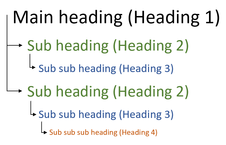
When you use headings, they need to be in the correct order on the page. The main heading, normally the page title, would be Heading 1. There should only be one Heading 1 used. The next level, and the heading you’d use most, is Heading 2. The sub-heading under Heading 2 would be Heading 3. You can’t skip a level of headings, so Heading 3 would never follow Heading 1.
How to add headings in Word
Highlight the text you want to apply the heading to.
In the ribbon click the button called ‘Styles’.
This will bring up the different heading types.
Click the correct heading to apply it to the text.
If you want to change how the headings look, right-click on the heading type and click ‘modify’.


