How to choose accessible colours
Colour contrast between text and the background can severely affect users’ ability to read content on a page. For text to be readable, it needs to have sufficient contrast with the background.
Approximately 1 in 12 men and 1 in 200 women have some degree of colour blindness (or colour vision deficiency). People with a form of colour blindness may have more trouble reading text that doesn’t have enough contrast with the background.
Other vision impairments also can impact the ability to read text. 2.2 million people in the UK are living with sight loss, so colour contrast has a huge impact on a large part of the population.
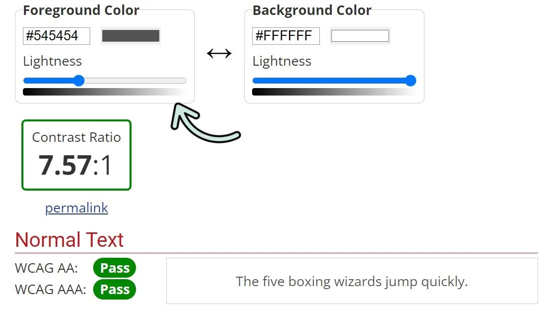
If you want to check the contrast between two colours, you can use the WebAim Colour Contrast Checker. You need to know the hex code (the number for each colour which starts with a #). You can either get this from the font colour selector in Word or PowerPoint, or upload an image to a website which will get the hex code for you.
Examples
This is a bad example of colour contrast. The form labels for username and password have poor contrast and are difficult to read. In the Web Aim colour contrast checker, there is a ratio of 1.49:1. The checker tells you that the contrast has ‘failed’ WCAG standards. WCAG 2.0 AA requires a contrast ratio of at least 4.5:1 for normal text and 3:1 for large text. You can use the slider in the contrast checker to find an accessible colour to use instead.
If you are using text over an image, you must also ensure there is enough contrast. In this example you can see the text is very hard to read. It is best to add a background to the text.


